UESPWiki:Featured Images/Past Nominations/Archive 6
| This is an archive of past UESPWiki:Featured Images/Past Nominations discussions. Do not edit the contents of this page, except for maintenance such as updating links. |
This is an archive of past nominations for Feature Images from December 2014 to August 2015.
Contents
- 1 File:ON-creature-Molag Bal.jpg
- 2 File:SR-power-Lycanthropy.jpg
- 3 File:MW-place-Ghostfence.jpg
- 4 File:SR-place-Statue to Meridia.jpg
- 5 File:ON-place-Windmill (Davon's Watch).jpg
- 6 File:DB-quest-Clean Sweep.jpg
- 7 File:SR-quest-Bolstering the Ranks 06.jpg
- 8 File:ON-place-Weeping Giant.jpg
- 9 File:OB-quest-Find the Heir.jpg
- 10 File:ON-quest-The Fires of Dune.jpg
- 11 File:ON-npc-Oanyin.jpg
- 12 File:ON-npc-Knight of the Iron Son.jpg
- 13 File:ON-creature-Harpy.jpg
- 14 File:SR-quest-Touching the Sky.jpg
- 15 File:SR-place-Solitude.jpg
- 16 File:OB-quest-Go Fish.jpg
- 17 File:SR-quest-Return to Grace.jpg
- 18 File:SR-quest-Dawnguard (quest).jpg
- 19 File:ON-place-Upper Craglorn.jpg
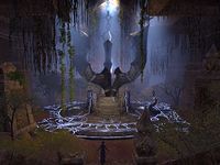
- 20 File:ON-interior-The Earth Forge.jpg
- 21 File:ON-quest-Long Lost Lore 02.jpg
- 22 File:ON-quest-Goblin Marq 02.jpg
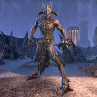
File:ON-creature-Molag Bal.jpg
A great image of ESO's final boss.
- Support: As nominator. —Legoless (talk) 19:14, 8 August 2015 (UTC)
- Support: Oh boy I can't wait to fight this ugly bastard (still a few quests away). Schiffy(Talk) 16:20, 25 August 2015 (UTC)
- Oppose: It's a cool-looking monster, but the shot itself is nothing special. I'm also not too keen on the idea of showing a final boss on the front page. Weroj (talk) 21:54, 28 August 2015 (UTC)
- Well, we've done it three times before. —Legoless (talk) 22:42, 28 August 2015 (UTC)
- Yes *sigh*. =) Spoiling the whole twist of SI was in really poor taste, I thought, the others less so. This one isn't nearly as bad as Sheogorath, but still... I'd rather not get a portrait of the final boss shoved in my face while searching the UESP for help on some quest. Weroj (talk) 01:36, 29 August 2015 (UTC)
- Well, we've done it three times before. —Legoless (talk) 22:42, 28 August 2015 (UTC)
- Oppose: Same reason(s) as Weroj. – Dragon Guard (talk) 20:23, 30 August 2015 (UTC)
- Oppose: I"m not at all opposed to the concept of posting an image that contains a spoiler on the main page. Hell, just above and to the left of the FA/FI it says "This site's purpose is to provide information; therefore, most of the content contains spoilers.". Spoilers come with the territory. I oppose this image not because it's got the potential to spoil ESO, but because it's not a well-captured image. The colours are all varying shades of blue that blend together, and I feel like that's caused a lot of detail and clarity in Molag Bal to be lost, which isn't helped by the fact that there's no source of light to brighten the subject and separate it from the backdrop. -damon talk ♥ contribs 06:01, 31 August 2015 (UTC)
- Oppose: I'm thinking along the same lines as Damon. I'm not opposed to spoiler-y pictures, because it's hard to tell the context just from the image in many cases (the image alone doesn't reveal that it's the final boss - for all anyone knows maybe you're just seeing him early on or something - and a statue of him even came with the collector's edition so it's not exactly unknown as to what he looks like.) It's just that Molag Bal is pretty shadowed and blends in with the background too much, and overall it's just not a standout image. ~ Alarra (talk) 07:19, 31 August 2015 (UTC)
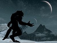
File:SR-power-Lycanthropy.jpg
This image is a classic - a werewolf looking at the moon. Two moons even! To me, the image feels really eerie and foreboding. It makes me wonder what is going to happen next now that this transformation has occurred. I think it would definitely capture our readers' attention if it was put on the main page.
- Support: As nominator. Forfeit (talk) 05:44, 11 July 2015 (UTC)
- Oppose: The lighting on the werewolf is a little dark. Maybe if it was brighter I would support it. – Dragon Guard (talk) 21:58, 11 July 2015 (UTC)
- Support: I prefer the dark werewolf, actually; it makes the subject seem more like a creature of the night. This is indeed a classic and almost spooky image. —likelolwhat talk lulzy to me 03:22, 12 July 2015 (UTC)
- Support: This picture is amazing. So atmospheric. --Enodoc (talk) 09:58, 18 July 2015 (UTC)
- Support: The extra darkness on the werewolf gives it some otherworldly shadowy darkness feel, pretty neat. •WoahBro►talk 13:36, 20 July 2015 (UTC)
- Comment: I like the image for the most part, but there's horizontal streaks throughout the sky and moons, and I dunno how picky we are on stuff like that for image quality. ~ Alarra (talk) 02:53, 9 August 2015 (UTC)
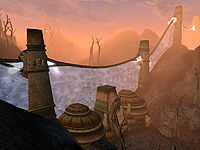
File:MW-place-Ghostfence.jpg
A really nice image of one of the many interesting things you can find in Morrowind. The dusk sky is beautiful as always.
- Support: As nominator. Forfeit (talk) 22:01, 25 June 2015 (UTC)
- Support: This seems to be one of the best Morrowind place images, and it has nice colors. Supported. ~ Alarra (talk) 06:30, 12 July 2015 (UTC)
- Support: Wow, a lot of MW images can't really stand up in 2015, but this still looks great. Super atmospheric. -- Hargrimm(T) 02:01, 18 July 2015 (UTC)
- Support: A great picture of an interesting location; the colour balance is great. --Enodoc (talk) 09:58, 18 July 2015 (UTC)
- Support: I love to see great images from older games, and I have a weakness for Morrowind. Fantastic shot. •WoahBro►talk 13:36, 20 July 2015 (UTC)
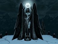
File:SR-place-Statue to Meridia.jpg
Clean and minimalistic, almost black and white classic.
- Support: As nominator. ~Shuryard (talk) 20:07, 25 June 2015 (UTC)
- Support: This is really cool. The orb of light works well with the darker background. Forfeit (talk) 22:01, 25 June 2015 (UTC)
- Support: Awesome, dramatic, very clean-looking image - I love it. ~ Alarra (talk) 23:20, 25 June 2015 (UTC)
- Support: Wonderful lighting and framing to really draw the eye to that mysterious orb. -- Hargrimm(T) 02:01, 18 July 2015 (UTC)
- Support: One of my favorite shots. Sometimes the subject doesn't need anything more than the most basic picture to capture its loveliness. --AKB Talk Cont Mail 02:05, 18 July 2015 (UTC)
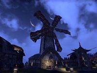
File:ON-place-Windmill (Davon's Watch).jpg
I thought this was captured in an interesting way, with the moons gleaming in between the spokes.
- Support: As nominator. Insignificant RevisionsThreats•Evidence 01:52, 8 June 2015 (UTC)
- Support: It's hard to get such a dark scene to capture well, but this is gorgeous and even manages to look very nice in thumbnail. -- Hargrimm(T) 12:04, 8 June 2015 (UTC)
- Support: Indeed, it's hard to take night time screenshots, but the results can be as wonderful as this. --Holomay (talk) 21:35, 11 June 2015 (UTC)
- Oppose: I may support it if the quality was slightly improved. – Dragon Guard (talk) 22:42, 11 June 2015 (UTC)
- Support: Nice image, especially for a night shot. I agree that the moons are a nice touch. Forfeit (talk) 04:58, 12 June 2015 (UTC)
- Oppose: I think that my general impression is that it's too dark with too bright a sky behind it (plus those lanterns stand out too). The sky almost makes it look like it's early dawn (it gets lighter the more you go toward the bottom), but the buildings are too dark for that. Part of the reason, I think, is that the amount of pale clouds makes it look at a glance like the sky is pale blue (like daytime) with dark clouds, rather than night with bright clouds; I think I might've first seen it that way. I think this shot would look fantastic during the day, or at sunset/sunrise, but the mess of light and dark just makes this image seem really off to me. ~ Alarra (talk) 05:52, 12 June 2015 (UTC)
- Support: As Hargrimm and Holomay said. --Vordur Steel-Hammer (TINV1K) 12:10, 12 June 2015 (UTC)
- Support: Maybe a bit dark, but I still like it beyond that. --AKB Talk Cont Mail 04:43, 13 June 2015 (UTC)
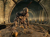
File:DB-quest-Clean Sweep.jpg
Good thing it is on pause... I keep waiting for the play button to be hit and then all the hell breaks loose :) Well-composed and well-lit image taken in just the right moment.
- Support: As nominator. ~Shuryard (talk) 17:46, 4 June 2015 (UTC)
- Support: That is truly impressive and eerie. Insignificant RevisionsThreats•Evidence 22:53, 4 June 2015 (UTC)
- Support: I may not be looking carefully enough, but dear god I love this image. The timing to get this pose does it for me. •WoahBro►talk 01:33, 5 June 2015 (UTC)
- Support: Good enough for me. Needs one more vote so we can snowball it if desired. FI should be updated today technically ~ Dwarfmp (talk) 19:22, 7 June 2015 (UTC)
- Oppose: Something about the image just stops me from supporting it. If it showed an ash spawn more standing-up, I may support it. – Dragon Guard (talk) 20:32, 7 June 2015 (UTC)
- Support: Very eerie and suspenseful. I like it. Forfeit (talk) 02:18, 8 June 2015 (UTC)
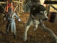
File:SR-quest-Bolstering the Ranks 06.jpg
This is a really nice action shot. The angle really adds to the image and makes it feel like the dog is going to jump out of the picture and attack you.
- Support: As nominator. Forfeit (talk) 04:46, 20 May 2015 (GMT)
- Support: Warning: May cause anxiety and incontinence in victims of doggie attacks. Insignificant RevisionsThreats•Evidence 19:12, 20 May 2015 (GMT)
- Support: My favorite dog attack shot. --Krusty (talk) 22:13, 20 May 2015 (GMT)
- Oppose: Just... I'm afraid I will have to oppose this one. The shot looks strange when the dog is in midair about to attack the undisclosed subject. – Dragon Guard (talk) 20:22, 24 May 2015 (UTC)
- Oppose: Something looks off with the Husky... -- SarthesArai Talk 21:13, 24 May 2015 (UTC)
- Comment: I wanted to comment here after these opposes. I think the image looks great contentwise, so as a thumb it looks how it should look. But when you look at the full image, I feel the quality is sub-par, and I don't know if that's because of just the AA (of which the game's highest setting isn't good enough at higher resolutions, so you'd have to use your drivers or another program), or if there's something else as well (maybe lower textures). In any case, that's what's been keeping me from supporting, but it's a very good screenshot, you can see there's thought and time put into this with excellent execution. I'm just wondering if this is a good enough reason not to support ~ Dwarfmp (talk) 01:16, 25 May 2015 (UTC)
- Oppose: Good idea, but the dog looks awkward with its front legs spread that far apart. Also, considering the relatively high resolution of the rest of the image, the dog's tongue looks really bad, and its position near the center of the image makes it worse. --Kozol (talk) 14:47, 27 May 2015 (UTC)
- Support: Great action shot. I also like the lack of anti-aliasing; gimme crisp pictures, none of that blurry nonsense. Weroj (talk) 12:13, 28 May 2015 (UTC)
- Oppose: The image is very nice, it is well composed and the intensity of the moment is just right. However, husky's ears and tongue look very weird, which is not photographer's fault, but still... ~Shuryard (talk) 17:46, 4 June 2015 (UTC)
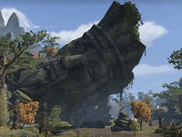
File:ON-place-Weeping Giant.jpg
I like big statues, and this one is big.
- Support: As nominator. Silence is GoldenBreak the Silence 01:46, 10 May 2015 (GMT)
- Support: I somehow failed to see the face at first, just thinking 'that's a nice rock'. Once I realized it's a statue, that's... marvelous. Weroj (talk) 22:23, 10 May 2015 (GMT)
- Support: Impressive. Forfeit (talk) 00:03, 11 May 2015 (GMT)
- Comment: Is it possible to get it taken in higher res? I like the angle and lighting, and it's an awesome subject, but some parts seem a bit blurry - not sure if that's because of the distance, or not. ~ Alarra (talk) 03:21, 11 May 2015 (GMT)
- Support: Looks very nice to me, and the blurriness is normal when you have Depth of Field on, so it doesn't bother me. --Vordur Steel-Hammer (TINV1K) 11:44, 11 May 2015 (GMT)
- Support: Good enough for me. Added my vote to close nomination ~ Dwarfmp (talk) 12:52, 24 May 2015 (UTC)
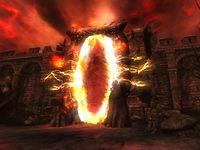
File:OB-quest-Find the Heir.jpg
This is a really nice image of an oblivion gate. The red sky and somewhat damaged city walls provide a good background for the gate. The image also captures a memorable part of Oblivion's main quest.
- Support: As nominator. Forfeit (talk) 19:22, 16 April 2015 (GMT)
Support: A good old fashioned Oblivion Gate. And the Kvatch one, to boot. I'm all for it. Schiffy(Speak to me|What I've done) 15:11, 23 April 2015 (GMT)- Oppose: The image is just that little too blocky; if it held a higher resolution, I may support it. – Dragon Guard (talk) 22:08, 7 May 2015 (GMT)
- Oppose: The image looks poor quality. Too much JPEG compression, perhaps? Weroj (talk) 22:23, 10 May 2015 (GMT)
- Oppose: Looking back on it, I have to agree with Dragon Guard. The concept of the Kvatch Oblivion Gate being featured is fine, but a better quality version may be in order. Schiffy (Speak to me|What I've done) 00:18, 11 May 2015 (GMT)
- Support: Oblivion gates are very pretty looking - Emoboy64 00:34, 11 May 2015 (GMT)
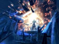
File:ON-quest-The Fires of Dune.jpg
A dark anchor penetrating a temple.
- Support: As nominator. ~Shuryard (talk) 04:52, 8 April 2015 (GMT)
- Support: This pleases me. Insignificant RevisionsThreats•Evidence 13:00, 8 April 2015 (GMT)
- Support: Looks very, very nice. --Vordur Steel-Hammer (TINV1K) 13:16, 8 April 2015 (GMT)
- Support: Looks like a good image from what appears to be an interesting scene. Forfeit (talk) 04:43, 13 April 2015 (GMT)
- Support: Not an ESO player but sure, looks nice. Schiffy (Speak to me|What I've done)
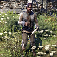
File:ON-npc-Oanyin.jpg
Similarly, this image depicts the NPC well, with a neutral, but nice-looking background.
- Support: As nominator ~ Dwarfmp (talk) 20:07, 8 March 2015 (GMT)
- Neutral: I want to get behind this, I really do, but there's just something about the quill in his hand that just doesn't feel 100% natural to me, and it's grinding me in just the wrong way, which is a problem for me looking at the image, since the light distribution across his face, hands, and chest meant the quill in the center of the image and the hand gripping it was what immediately caught my eye. The rest of the image is very nice, but there's just a problem I can't quite place with his hand and the quill. Damon(talk•email) 20:34, 8 March 2015 (GMT)
- Oppose: I am not a big fan of his posture and quill. – Dragon Guard (talk) 23:20, 28 March 2015 (GMT)
- Oppose: I am afraid I just fail to see what is special with it. Good light, but not enough. —MortenOSlash (talk) 08:34, 29 March 2015 (GMT)
- Oppose: I think this is a good NPC image, but I agree with Morten in that it lacks any sort of special features to set it apart from other NPC images. The quill pose isn't all that interesting and does look a little strange, though I don't really think it's that big of an issue and probably can't be helped. Overall, it's a nice image but I wouldn't want to see it featured on the main page when there are more interesting images to choose from. Forfeit (talk) 04:30, 30 March 2015 (GMT)
- Oppose: As already mentioned, it's a good image, but it just doesn't have that extra-special "something" that makes it stand out. ~ Alarra (talk) 06:41, 30 March 2015 (GMT)
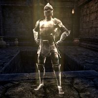
File:ON-npc-Knight of the Iron Son.jpg
I specifically browsed through the Online NPC images, because I believe that'd be a first to have featured, and would set the example (and would put Online in the spotlight some more, considering the lack of Online featured articles). This one I like, because the NPC is well-centered, the AA is good, the contrast is too, which brings the NPC out well, and the pose of course. It's not a big image, but that shouldn't be a problem in this case.
- Support: As nominator ~ Dwarfmp (talk) 20:07, 8 March 2015 (GMT)
- Support: Agreed, a good piece of work here. Damon(talk•email) 20:34, 8 March 2015 (GMT)
- Support: Good and clear, great pose, and I like the contrast between the ghost and the background. ~ Alarra (talk) 20:07, 14 March 2015 (GMT)
- Support: For all the reasons Dwarfmp noted, thumbs up from me. — ABCface◥ 18:36, 24 March 2015 (GMT)
- Support: A good pose. Nothing more and nothing less. —MortenOSlash (talk) 08:34, 29 March 2015 (GMT)
- Oppose: Something just tells me it's not that special but can't place what. Maybe it's with the lighting on him. – Dragon Guard (talk) 19:18, 29 March 2015 (GMT)
- Support: Per Dwarf. I really like the pose. Forfeit (talk) 04:30, 30 March 2015 (GMT)
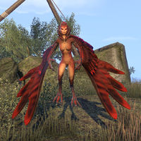
File:ON-creature-Harpy.jpg
That is just beautiful designing, captured perfectly. Bravo!
- Support: As nominator. Insignificant RevisionsThreats•Evidence 20:47, 31 January 2015 (GMT)
- Oppose: The image is okay, but I don't think it's worthy of featured status. – Dragon Guard (talk) 21:55, 31 January 2015 (GMT)
- Oppose: Cool, but not FI cool. -damon talk ♥ contribs 22:11, 31 January 2015 (GMT)
- Comment: Damon, don't you think the creature overshadows the image? I do. – Dragon Guard (talk) 22:30, 31 January 2015 (GMT)
- The creature is the image. —Legoless (talk) 22:36, 31 January 2015 (GMT)
- I'll explain in more words why I think the image is "okay". One, the position of the creature. Two, having a front close-up shot of it is just boring. – Dragon Guard (talk) 14:36, 1 February 2015 (GMT)
- The creature is the image. —Legoless (talk) 22:36, 31 January 2015 (GMT)
- Oppose: This is a good image that captures the creature well. However, I think the image might have more potential. If the creature is hostile, an image of the harpy attacking could probably produce a more interesting shot, perhaps a pose similar to the oldest version of the image. As it is, it's just a well captured portrait shot that isn't all too remarkable. Forfeit (talk) 00:39, 1 February 2015 (GMT)
- Support: Might as well cast a vote, since the disproportionate opposition here to a perfect image is a little disheartening. This is the quintessential harpy. —Legoless (talk) 01:45, 1 February 2015 (GMT)
- Support: It looks so interesting and well-made that I think it's worth getting FI status. --Vordur Steel-Hammer (TINV1K) 01:56, 1 February 2015 (GMT)
- Oppose: It's nice and clear, but something just bothers me about the pose and the way that the feathers on the right side look, to the point that I've been tempted to re-take it. The image has good color and shows a harpy clearly, but it just seems more of an average portrait; I just don't think of it as FI-worthy. - Alarra (talk) 17:05, 1 February 2015 (GMT)
- Comment: Is it supposed to be standing on the ground or hovering just above it? This is one that I've had to look at and come back to and still unsure about it, but can't put my finger on what's stopping me supporting it. Biffa (talk) 17:43, 1 February 2015 (GMT)
-
- It's hovering, I think. And maybe it appears off center, because the wings are different sizes? Insignificant RevisionsThreats•Evidence 17:49, 1 February 2015 (GMT)
- Yep, it's hovering. The wings aren't different sizes, but on the right side, the largest feathers are at kind of a sideways angle to the camera so you're only seeing the edge of the feathers, and they appear nearly invisible (especially with the dark rock behind them). - Alarra (talk) 18:30, 1 February 2015 (GMT)
- Alarra: tell me then (because I don't play ESO), can it stand on the ground as well as hover. I was just going to say — if it's standing it would be a Godzilla harpy! – Dragon Guard (talk) 19:23, 1 February 2015 (GMT)
- Yep, it's hovering. The wings aren't different sizes, but on the right side, the largest feathers are at kind of a sideways angle to the camera so you're only seeing the edge of the feathers, and they appear nearly invisible (especially with the dark rock behind them). - Alarra (talk) 18:30, 1 February 2015 (GMT)
- It's hovering, I think. And maybe it appears off center, because the wings are different sizes? Insignificant RevisionsThreats•Evidence 17:49, 1 February 2015 (GMT)
- Oppose: The wing on the right makes it so I can't support it in good conscience. ~ Ad intellige (talk) 01:40, 2 February 2015 (GMT)
- Support: I like it enough to put my support behind it. --AKB Talk Cont Mail 21:10, 2 February 2015 (GMT)
- Oppose: There's nothing really all that wrong with the image; it serves its purpose and the awkward angle on the left wing doesn't really detract from the usefulness of the image. It's perfectly fine for an article and doesn't really need to be replaced to be used. It just doesn't have that "something extra" I'd expect from an FI. --GKtalk2me 21:43, 2 February 2015 (GMT)
- Comment: I've uploaded a new version with what I think is better color/shadow balance and a better pose. I still don't think it's FI material, but thought I'd make a note here that I did so, because the above comments were for the previous version. - Alarra (talk) 08:02, 13 February 2015 (GMT)
-
- Since all the votes here up until now are for another picture than what is currently shown anyway, it is no longer valid, I guess? —MortenOSlash (talk) 07:27, 14 February 2015 (GMT)
- I have to concur with that. While the current image is a better profile than before, and is arguably a better image all-around, it's not what I nominated. Insignificant RevisionsThreats•Evidence 17:37, 14 February 2015 (GMT)
- Since all the votes here up until now are for another picture than what is currently shown anyway, it is no longer valid, I guess? —MortenOSlash (talk) 07:27, 14 February 2015 (GMT)
File:SR-quest-Touching the Sky.jpg
An awesome image.
- Support: as nominator. – Dragon Guard (talk) 16:54, 24 January 2015 (GMT)
- Comment: This image was already nominated and no consensus was reached. I think we should defer to the previous judgement. —Legoless (talk) 16:59, 24 January 2015 (GMT)
-
- Comment: I'll make this short. That was a long time ago. People have moved in and out of the wiki. New people have come, new people have left etc. This time it might just pass at being supported. I'm asking you — please can you give it a chance to be nominated again and not close this nomination early? – Dragon Guard (talk) 18:38, 24 January 2015 (GMT)
- Oppose: I love the image, but as many posters complained about the last time, it's just too blurry to be featured, in my opinion. If a similar but sharper shot were to replace it, my vote might change. – Robin Hood (talk) 19:40, 24 January 2015 (GMT)
- Oppose:: While the image is brilliant, the overexposure on the subject and the lower image quality make it a no from me. It could easily be re-done to get a sharper version, probably using the console to remove some of the atmospheric effects that the explosion has. --GodRaineTalk 19:45, 24 January 2015 (GMT)
- Oppose: I voted barely neutral, mostly oppose last time, so this time I'll just outright oppose it. I don't see the point in re-opening a nomination that has already been had when it's the exact same image as before. -damon talk ♥ contribs 20:00, 24 January 2015 (GMT)
- Oppose: Pacta sunt servanda. Insignificant RevisionsThreats•Evidence 20:24, 24 January 2015 (GMT)
- Oppose: Looks good as a thumb, but way too blurry up close. ~ Ad intellige (talk) 06:00, 25 January 2015 (GMT)
- Comment: If it's too blurry/blocky, why can't we get a re-upload? Doesn't make sense to me... – Dragon Guard (talk) 10:22, 26 January 2015 (GMT)
- Because a lot of our Skyrim image takers are retired, MIA, busy with other things, and/or can't get to this one particular moment at the drop of a hat, just because it's in an FI nomination. •WoahBro►talk 14:55, 26 January 2015 (GMT)
- MIA? Haha — you're funny, WoahBro :) I don't know if that was meant to be funny, intentionally, but I thought it was, so I will leave it there. Maybe one day Psylocke will get around to re-uploading it to remove the blocky parts. After all, which would you rather have — a sharper image, or a blocky one? Because our aim is to upload the best images we can, I would recommend a sharper image. What do you think? – Dragon Guard (talk) 15:02, 26 January 2015 (GMT)
- Also, I've re-uploaded the image with a much sharper one, so you might want to start supporting it. Just for clarification, is the aspect ratio correct? Yes or no? – Dragon Guard (talk) 18:02, 26 January 2015 (GMT)
- As my re-upload was reverted for being overly-saturated, I have now made the image so it is not modified with saturation boosts. – Dragon Guard (talk) 18:47, 26 January 2015 (GMT)
You uploaded exactly the same file.(Maybe not...it looks like our server's getting confused.) In any event, I don't think editing the existing image is going to help. Using image editing software to alter an image is discouraged beyond a certain point. Those levels of contrast and saturation are well beyond what you'd see in-game, so are inappropriate. – Robin Hood (talk) 18:57, 26 January 2015 (GMT)- Would it have to be a completely new upload to resolve the blocky image, with a higher resolution monitor perhaps? Essentially the same as trying to turn a 360p image into a 720p one through advanced editing software? – Dragon Guard (talk) 19:05, 26 January 2015 (GMT)
- Yes. – Robin Hood (talk) 19:07, 26 January 2015 (GMT)
- And modifying the image to make it sharper proves impossible because the blocky image is too low-quality to turn into a sharp high-quality image; the poor parts clearly show through? – Dragon Guard (talk) 19:10, 26 January 2015 (GMT)
- Yes, you've understood the problem exactly. – Robin Hood (talk) 20:07, 26 January 2015 (GMT)
- OK then. Now that's out of the way I don't think there will be need for any further discussion. – Dragon Guard (talk) 20:10, 26 January 2015 (GMT)
- Yes, you've understood the problem exactly. – Robin Hood (talk) 20:07, 26 January 2015 (GMT)
- And modifying the image to make it sharper proves impossible because the blocky image is too low-quality to turn into a sharp high-quality image; the poor parts clearly show through? – Dragon Guard (talk) 19:10, 26 January 2015 (GMT)
- Yes. – Robin Hood (talk) 19:07, 26 January 2015 (GMT)
- Would it have to be a completely new upload to resolve the blocky image, with a higher resolution monitor perhaps? Essentially the same as trying to turn a 360p image into a 720p one through advanced editing software? – Dragon Guard (talk) 19:05, 26 January 2015 (GMT)
- As my re-upload was reverted for being overly-saturated, I have now made the image so it is not modified with saturation boosts. – Dragon Guard (talk) 18:47, 26 January 2015 (GMT)
- Also, I've re-uploaded the image with a much sharper one, so you might want to start supporting it. Just for clarification, is the aspect ratio correct? Yes or no? – Dragon Guard (talk) 18:02, 26 January 2015 (GMT)
- MIA? Haha — you're funny, WoahBro :) I don't know if that was meant to be funny, intentionally, but I thought it was, so I will leave it there. Maybe one day Psylocke will get around to re-uploading it to remove the blocky parts. After all, which would you rather have — a sharper image, or a blocky one? Because our aim is to upload the best images we can, I would recommend a sharper image. What do you think? – Dragon Guard (talk) 15:02, 26 January 2015 (GMT)
- Because a lot of our Skyrim image takers are retired, MIA, busy with other things, and/or can't get to this one particular moment at the drop of a hat, just because it's in an FI nomination. •WoahBro►talk 14:55, 26 January 2015 (GMT)
- Oppose: Per everyone else. I don't know if the blur can be removed because of the effect that is going on, but if it is possible, I probably would support it. •WoahBro►talk 14:55, 26 January 2015 (GMT)
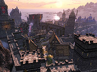
File:SR-place-Solitude.jpg
When I was browsing looking for an image I could nominate, I thought maybe Solitude would have the perfect image. So I went on the article, clicked on the image with a birds-eye-view of the city, and that's when I thought "OMG! This is SO realistic! This MUST be featured I tell you!" In my honest opinion, I would love to see this image reach featured status as a lot of hard work was done to get the shot just right. Such exemplar details that add a lot of realism include, but are not limited to—the chimney smoke, the buildings, mountain detail, the sun setting in the background, its reflection on the surface of the ocean, and last but NOT least—the birds flying around in the sky. I would really appreciate all your support people! Thanks!
- Support: As nominator. – Dragon Guard (talk) 21:55, 16 January 2015 (GMT)
- Support: While there is a little bush thing at the very bottom and a couple of the birds are slightly messed up, I believe those are game issues. Plus they are really hard to notice and minor. Pyslocke needs to come back to give us more images (I think all of her nominated images were featured) ~ Ad intellige (talk) 04:48, 17 January 2015 (GMT)
- Support: Psylocke knows her sh... uh... stuff! She's definitely one of the best photographers I've seen, and I'd lie if I said I didn't have a few of her pics on rotation as desktop images. -damon talk ♥ contribs 04:53, 17 January 2015 (GMT)
- Support: I was worried that there might be some mods involved with this image, but I can't find any evidence of such. Plus Psylocke always takes the best images. •WoahBro►talk 07:17, 17 January 2015 (GMT)
- Support: A stunning view. It is one of these pictures you start wonder why no-one has nominated for Featured Image before. The only thing to comment on is that all high altitude pictures in Skyrim renders the sea horizon a tiny bit too high for a spherical world, but that is a general game issue, not specific for this picture. —MortenOSlash (talk) 08:13, 17 January 2015 (GMT)
- Support: Great shot! -- SarthesArai Talk 10:11, 17 January 2015 (GMT)
- Support: That lighting, that colors... and you can even see a tiny College of Winterhold on the horizon! As someone who loves colorful landscape screenshots, I can support this without question. --Vordur Steel-Hammer (TINV1K) 13:39, 17 January 2015 (GMT)
- Support: That's definitely the College. But I do echo Woahbro's concerns about modding; I'm not sure you should be able to see the College from this point in Solitude. Might be a mod to achieve that effect? Insignificant RevisionsThreats•Evidence 17:32, 17 January 2015 (GMT)
- Of course you can and should be able to see the College from here, I remember seeing it from these parts as well. The draw distance is really big in Skyrim. Remember that it is possible to see the White-Gold Tower and the Red Mountain from some places. I can try to confirm that if you want. --Vordur Steel-Hammer (TINV1K) 17:52, 17 January 2015 (GMT)
- Support: Great image. Biffa (talk) 18:17, 17 January 2015 (GMT)
- Support: Well-lit, excellent angle, shows off most of the city in a beautiful light from the time of day, and for some reason the hawks in the sky really put the bow on the image. Great shot. --GodRaineTalk 19:47, 24 January 2015 (GMT)
- Support: Very nice image of Solitude, with the College of Winterhold in the background. I like the bird too. --Krusty (talk) 05:30, 25 January 2015 (GMT)
- Support: Excellent image. Very good details on the city, and I love the background mountains and shore and sky. - Alarra (talk) 17:13, 1 February 2015 (GMT)
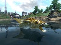
File:OB-quest-Go Fish.jpg
This is an excellent image for the quest. It captures the main focus of the quest in a great pose rather than just using a simple underwater shot. The background of the image and the reflection on the water also add to the high quality of the image. I think this would be an excellent fit for the front page as it showcases the creativity and skills that our photographers have.
- Support: As nominator. Forfeit (talk) 07:23, 7 January 2015 (GMT)
- Support: Thanks! I was mainly going for the slaughterfish lunging itself in your face, which would've made it look scarier, but the slaughterfish's mouth is not very detailed, and up close that was more obvious, so I went with this balanced shot in which the slaughterfish is well visible. I think I captured the quest right, you can see you're in Lake Rumare because of the the IC, the bridge, and the Wawnet Inn in the background. You can even see the water ribbles from the slaughterfish moving towards you, and the reflections of the buildings and the fish. All in all, not a very spectacular image, but I think it's interesting, if I say so myself ~ Dwarfmp (talk) 23:06, 7 January 2015 (GMT)
- Oppose: My opinions: one, the lack of detail (such as the mouth). Two, "not a very spectacular image" probably means it isn't good enough to be featured. — Unsigned comment by Dragon Guard (talk • contribs) at 16:34 on 8 January, 2015 (GMT)
- Support: Per Dwarf. ~ Ad intellige (talk) 22:12, 8 January 2015 (GMT)
- Support: A very interesting and good-looking image. --Vordur Steel-Hammer (TINV1K) 22:26, 8 January 2015 (GMT)
- Oppose: Admittedly, this is more of a fault in the game mechanics that it looks like this and there's no correction for it, but I really don't like how the fish pokes out of the still water as if it was a static object screwed down to a base object or something. It just doesn't look pretty the way it hangs out of the water like that. Everything else about this image screams gorgeous, but I can't look past the weird way the fish is resting on the water. -damon talk ♥ contribs 22:41, 8 January 2015 (GMT)
-
- Comment: That's actually not that unusual for a real fish. – Robin Hood (talk) 22:56, 8 January 2015 (GMT)
-
- Comment: I get that. I should rephrase it. The action the fish is making, I get is natural. It looks fake and ugly because the water can't splash and texture the image to look like the water moves. That's what I meant when I said it looked like a fish was screwed into a base. The water is practically flat as a pane of glass with no sign that it's really been disturbed, aside from the faintest ripple in the back, which is what the game allows for water motion. -damon talk ♥ contribs 23:05, 8 January 2015 (GMT)
-
- Comment: I wondered if that might've been what you meant, but I wasn't sure, so figured I'd post and see what you said. Thanks for clarifying the specifics. – Robin Hood (talk) 23:08, 8 January 2015 (GMT)
- Support: Reminds me of an alligator gar I caught once ... didn't go swimming for about five years after that. Insignificant RevisionsThreats•Evidence 23:34, 8 January 2015 (GMT)
- Support: That's a pretty awesome shot, I can't imagine trying to get the timing perfect. None of the concerns raised really outweigh the story and awesomeness of this image (at least to me). •WoahBro►talk 01:18, 9 January 2015 (GMT)
-
- Comment: Going back to Oblivion screenshots from Skyrim, the lack of slowing time made it feel really difficult. It was all about in-game waiting and finding out the best time of day to get the right lighting, getting the fish to attack you and swim backwards looking that same direction, and bashing the screenshot button to make a hundred shots, while eventually comparing the best of them and deciding whether you're content with the result or try again. Not THAT difficult, but time-consuming ~ Dwarfmp (talk) 01:26, 9 January 2015 (GMT)
- Support: I think it's a good screenshot, and really suitable for that particular quest. I'd say both the idea and the time invested deserve a featured status. We shouldn't deny featured status just because of some minor (in my opinion) engine and resource flaws of older games. -- SarthesArai Talk 13:28, 9 January 2015 (GMT)
- Support: An image in which the shortcomings of the engine have been overcome with wonderful results. --Holomay (talk) 15:46, 13 January 2015 (GMT)
- Support: Worthy of the star. Biffa (talk) 12:32, 14 January 2015 (GMT)
File:SR-quest-Return to Grace.jpg
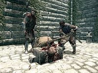
This image is a very-well captured close-up shot of Roggvir's execution. Skyrim has very few beheadings (two I think, including this one.
- Support: As nominator. – Dragon Guard (talk) 15:50, 1 January 2015 (GMT)
- Oppose: If the executioner had a different pose (perhaps a mid-swing), then this would look cool, but the way he's hunched over the blade at the end of his swing just looks odd and, frankly, quite boring. -damon talk ♥ contribs 16:09, 1 January 2015 (GMT)
- Oppose: My main objection is the lack of contrast, the whole image is light and grayish. The AA is insufficient too, I can't stand blocky edges. The bloody decapitation is cool though, I'll give you that ~ Dwarfmp (talk) 16:24, 1 January 2015 (GMT)
- Oppose: I don't think we really need to showcase so much gore. Additionally, not enough contrast. -- SarthesArai Talk 17:26, 1 January 2015 (GMT)
- Comment: OK. Can someone re-upload the image but with Ahtar in mid-swing and not hunched over? And add more contrast? – Dragon Guard (talk) 18:22, 1 January 2015 (GMT)
- Oppose: I generally like the image, except for the part of the wall immediately to the right of Captain Aldis with the ivy growing down it. The edges run straight through the blockwork of the wall and looks odd. If the image could be retaken without this glitchy section I would support. Biffa (talk) 12:27, 6 January 2015 (GMT)
- Comment: Where shall I request a re-upload of this image? – Dragon Guard (talk) 17:31, 6 January 2015 (GMT)
- Comment: There is no need to re-upload the image, it suits its purpose perfectly. This is a discussion on whether or not to feature the image, not necessarily replace it. Additionally, there's nothing wrong with Ahtar's pose. —Legoless (talk) 17:55, 6 January 2015 (GMT)
- Comment: Damon finds the pose boring and odd. Don't know about you but why do you think the pose is fine as it is. Do you mean wrong as in incorrect or...do you mean wrong as in "wrong" being a sexual reference in this pose — read at your own risk — ? When I looked at the image after you comment, I noticed this. Anyway, I'm digressing (sort of). I think the image needs reuploading because of the blocky edges. Don't know if these make images eligible for a re-upload? – Dragon Guard (talk) 21:30, 8 January 2015 (GMT)
- Comment: There is no need to re-upload the image, it suits its purpose perfectly. This is a discussion on whether or not to feature the image, not necessarily replace it. Additionally, there's nothing wrong with Ahtar's pose. —Legoless (talk) 17:55, 6 January 2015 (GMT)
- Oppose: The picture is just really gray and dull. The gore I think is just fine, since it is a mature game (I think every one of TES is). ~ Ad intellige (talk) 22:12, 8 January 2015 (GMT)
- Oppose: Too gray and dull, like Dominus said. --Vordur Steel-Hammer (TINV1K) 22:26, 8 January 2015 (GMT)
File:SR-quest-Dawnguard (quest).jpg
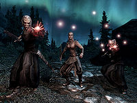
I accidentally found this image and fell in love with it at first sight. I love that blue-greenish ambient light coming from the aurora in the sky and the way it interacts with the vampires' red spells. The posing and lighting of the vampires is also great. In my opinion, that image is just brilliant.
- Support: As nominator. Vordur Steel-Hammer (TINV1K) 15:00, 27 December 2014 (GMT)
- Support: Always liked this one. Insignificant RevisionsThreats•Evidence 17:15, 27 December 2014 (GMT)
- Support: One of the easiest images to support I've seen. Biffa (talk) 17:58, 27 December 2014 (GMT)
- Oppose: The NPCs look very odd. That blue-greenish ambient light coming from the aurora in the sky is rather unnatural. – Dragon Guard (talk) 15:50, 1 January 2015 (GMT)
- Support: Per nominator. Brilliant image. -damon talk ♥ contribs 16:07, 1 January 2015 (GMT)
- Support: No additional comments from me ~ Dwarfmp (talk) 16:24, 1 January 2015 (GMT)
- Support: Looks like a creepy threatening vampire threat. -- SarthesArai Talk 17:26, 1 January 2015 (GMT)
File:ON-place-Upper Craglorn.jpg
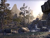
A simple but effective image. It shows the landscape quite well.
- Support: As nominator. —<({QT>> 04:38, 16 December 2014 (GMT)
- Support:lovely image, which we should encourage more of on the FI section. It seems that most supported images are action shots with bright colors. Biffa (talk) 12:04, 17 December 2014 (GMT)
- Support: I feel totally guilty for supporting my own screenshot again, but... it does look lovely. --Vordur Steel-Hammer (TINV1K) 20:36, 17 December 2014 (GMT)
- Support: Nice textures, great colors. I love the sense of depth too, with the path and the mountains in the distance. - Alarra (talk) 05:59, 20 December 2014 (GMT)
- Oppose: There's nothing bad about this image, it's just that this is another average image on the site. — DG#:) 21:25, 20 December 2014 (GMT)
- Support:I just like the image and I think it will look nice in the main page. Moinante (talk) 21:29, 21 December 2014 (GMT)
- Support: Light, depth and colors add up to a lovely nature scene. --Holomay (talk) 14:03, 29 December 2014 (GMT)
File:ON-interior-The Earth Forge.jpg
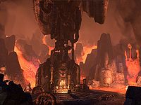
An eye-catching shot of a Dwemer ruin. I think it has that perfect mix of eerie and intriguing, much like the people that built it.
- Support: As nominator. —<({QT>> 04:38, 16 December 2014 (GMT)
- Support: It is certainly eye-catching! Very shiver-inducing too. (I'm not sure if I like the monochrome though.) —likelolwhat talk lulzy to me 05:54, 16 December 2014 (GMT)
- Support: Dwemer stuff and lava always look cool together... The Earth Forge reminds me of the Aetherium Forge. As for the image, the colors and contrast are really very nice to the eye. --Vordur Steel-Hammer (TINV1K) 12:53, 16 December 2014 (GMT)
- Oppose:Colors seem too muted for the subject. Too much of the background blurred together. Biffa (talk) 12:07, 17 December 2014 (GMT)
- Comment: I'd like to point out that UI elements are partially visible at the upper edge of the image. It can be cropped, of course, but the original image has already been cropped to 4:3 from what I think was already a less than ideal framing. I have a screenshot of the place that I haven't been able to upload yet. I took it without UI elements in the first place, and in my opinion it has better contrast, lighting, angle and framing. Normally, I'd just have replaced the current image, but as this is in the middle of the nomination process, I'm very reluctant to do so. I don't just want to jump in and shout "Vote for my image!", especially since there are already three supportive votes for this version of the image. So before I do anything, I'd like to have some feedback on the issue. --Holomay (talk) 10:30, 18 December 2014 (GMT)
- Oppose: I agree with Biffa. DG#:) 17:59, 23 December 2014 (GMT)
- Support: Looks good to me. Insignificant RevisionsThreats•Evidence 17:15, 27 December 2014 (GMT)
- Oppose: As I have stated above, I think that angle, framing and lighting are less than ideal. Also, UI elements are partially visible, and therefore the image as it appears now does not meet the site's image standards. A standard cleanimage template could be added to it, and I think that's weird for an image in the nomination process. There was no feedback on my comment from any of those who have voted, so I'm uncertain whether the UI element has not been noticed or whether it was considered unimportant. --Holomay (talk) 14:17, 29 December 2014 (GMT)
-
- Comment: As Legoless has suggested, I've uploaded a different screenshot seperately as ON-quest-The Prismatic Core 02.jpg. --Holomay (talk) 14:17, 29 December 2014 (GMT)
- Oppose: The nominated Image is a bit too brownblurry as well as of-center. I can see the UI-Element, but I think that's no big deal (simply cropping a few lines of pixels at the top and the sides should suffice). Holomays screenshot, on the other hand, is a bit oversaturated in my opinion (I am hard to please as it seems...). -- SarthesArai Talk 16:10, 29 December 2014 (GMT)
File:ON-quest-Long Lost Lore 02.jpg
An "in-action" image that captures a heated encounter of two historical characters.
- Support: As nominator. - Shuryard (talk) 21:33, 15 December 2014 (GMT)
- Support:Nice image, good focus and textures. Biffa (talk) 22:36, 15 December 2014 (GMT)
* Oppose: I would definitely have supported it if it did not have the companion marker by the candle over Sheogorath's hand. Once I discovered it I am not able to ignore it. —MortenOSlash (talk) 22:50, 15 December 2014 (GMT)
-
- Update: I re-uploaded. Thank you for pointing it out! :) - Shuryard (talk) 23:07, 15 December 2014 (GMT)
- Question: I still see the marker. Is it my cache that fools me? —MortenOSlash (talk) 05:59, 16 December 2014 (GMT)
- Comment: I was getting it too. I purged the page and force-refreshed it, then it was fine. – Robin Hood (talk) 06:43, 16 December 2014 (GMT)
- Comment: And then it is gone, and I have withdrawn my opposition. —MortenOSlash (talk) 19:51, 16 December 2014 (GMT)
- Comment: I was getting it too. I purged the page and force-refreshed it, then it was fine. – Robin Hood (talk) 06:43, 16 December 2014 (GMT)
- Question: I still see the marker. Is it my cache that fools me? —MortenOSlash (talk) 05:59, 16 December 2014 (GMT)
- Update: I re-uploaded. Thank you for pointing it out! :) - Shuryard (talk) 23:07, 15 December 2014 (GMT)
- Support: Pretty cool image for a cool subject. I like it. —likelolwhat talk lulzy to me 05:54, 16 December 2014 (GMT)
- Support: Morten, I think it is the cache. Clicking on the thumb still shows the marker, but clicking on the most recent version doesn't. I was kinda on the edge with this image, but I think that the intensity of the moment between these two characters is enough for me to support. •WoahBro►talk 06:14, 16 December 2014 (GMT)
- Support: "Boooooring!" That's what Sheogorath yells at that moment. The image's not boring, though. I like it. --Vordur Steel-Hammer (TINV1K) 12:46, 16 December 2014 (GMT)
- Support: With the marker gone, I can wholeheartedly support it. —MortenOSlash (talk) 19:51, 16 December 2014 (GMT)
- Support: Great action shot. - Alarra (talk) 05:59, 20 December 2014 (GMT)
- Support: These quick action shots are much harder to capture in ESO than any other game, so this is especially impressive and well-framed. -- Hargrimm(T) 19:21, 20 December 2014 (GMT)
- Support: It's not only a good action shot, but thematically, it illustrates a long-running theme of TES lore: you can't screw with Sheogorath. Insignificant RevisionsThreats•Evidence 17:15, 27 December 2014 (GMT)
File:ON-quest-Goblin Marq 02.jpg
I think this is the best NPC portrait I saw in the game. The body texture feels almost 3D and the light is just spectacular. It is very hard to get those dark tones and shadows right, plus I like the contrast between the dark face and the sun behind it.
- Support: As nominator. Moinante (talk) 10:25, 6 December 2014 (GMT)
- Oppose: It is well-framed, but the killer for me is the weird compression artifacts in the sky to the left of his head. I don't know if the image was saved with bad quality settings or what, but the jagged, pixelated lines there just detract from the whole image for me. -- Hargrimm(T) 20:19, 6 December 2014 (GMT)
-
- Comment I rarely comment on these things, but I am definitely not seeing any weird jagged, pixelated lines at all... all I see are brightness and then mountains... Jeancey (talk) 21:45, 6 December 2014 (GMT)
- Comment It may depend on your monitor settings. I see them quite clearly. The sun's shading between the top of the guy's head and the top of the mountain is very blocky. – Robin Hood (talk) 01:10, 7 December 2014 (GMT)
- Support: I like the way the lightsetting of the picture gives it a stunning effect, and I can not say I find pixelating coming through as prominent, even when zooming in to show it 100 %. —MortenOSlash (talk) 07:31, 7 December 2014 (GMT)
- Support: I can't see anything there. I do see some blockiness to the right of his head when I push my laptop's screen back and look at it funny, but really I don't think that should matter. It's an interesting, well-shot image. —likelolwhat talk lulzy to me 09:10, 7 December 2014 (GMT)
- Support: A well-composed, cinematic shot. Personally, I'm not seeing any weird pixelated lines. —<({QT>> 04:48, 8 December 2014 (GMT)
- Support: This looks great. The lighting really adds to the image. I don't think I've seen a portrait shot like this featured in a while, so this will also help add some variety to the images being featured. Forfeit (talk) 19:59, 10 December 2014 (GMT)
- Support: Crackingly good image IMO. Biffa (talk) 23:44, 11 December 2014 (GMT)
- Oppose / Comment: Okay, okay, I guess I had to visit the Featured Images page sooner or later and participate... Well now maybe I wanna say what I really think. Well, you see, I've got a theory. I don't know about supporting it. This is okay, if you asked me. But... You know, this type of image, not my style. Just not quite exemplar. DG#:) 21:26, 12 December 2014 (GMT)
- Oppose: His posture is just incredibly strange to me. It almost looks unnatural at this angle and with this lighting. -damon talk ♥ contribs 00:09, 16 December 2014 (GMT)
-
- Comment: He might be meant to look like that in-game, due to the context. He's not in his right mind and thinks he's a goblin during the quest where you see him, likely while drunk (the quest's about how he goes to be with the goblins after they steal his "special brew"). - Alarra (talk) 05:59, 20 December 2014 (GMT)
-
- Comment: Well, holding a strange posture because he's a nutter and wants to hold it is fine and good, but the way it's captured in the image still makes it really awkward and not very photogenic, not to mention most of the deal-breaker for me is in the lighting balance, as that's the dominant image feature. I appreciate the clarification, though, as I never look at nominations' articles, as they aren't necessarily relevant to the image during an FI vote. -damon talk ♥ contribs 20:31, 26 December 2014 (GMT)
- Support:Kinda spooky. I like it. Insignificant RevisionsThreats•Evidence 17:15, 27 December 2014 (GMT)
| Prev: Archive 5 | Up: Featured Images/Past Nominations | Next: Archive 7 |
