UESPWiki:Featured Images/Past Nominations/Archive 1
| This is an archive of past UESPWiki:Featured Images/Past Nominations discussions. Do not edit the contents of this page, except for maintenance such as updating links. |
This is an archive of past nominations for Featured Images from April, May, and June of 2011.
Contents
- 1 SI-Sheogorath Changing.jpg
- 2 OB-npc-Hunting Tail.jpg
- 3 File:SI-place-Mount Sheogorath Summit.jpg
- 4 File:OB-quest-Alteration Training.jpg
- 5 File:MW-place-Lake Masobi.jpg
- 6 OB-quest-An Unexpected Voyage.jpg
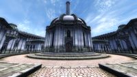
- 7 OB-npc-J'Ghasta.jpg
- 8 MW-creature-Vivec.jpg
- 9 MW-place-Dagoth Ur.jpg
- 10 OB-place-The Temple of the One.jpg
- 11 OB-Bruma-01.jpg
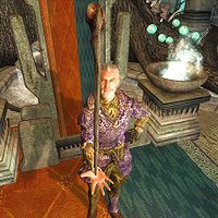
- 12 SI-npc-Sheogorath Cane.jpg
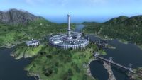
- 13 OB-place-Imperial City.jpg
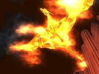
- 14 OB-Avatar of Akatosh.jpg
- 15 OB-place-Frostcrag Planets.jpg
- 16 OB-npc-Etira Moslin.jpg
- 17 MW-quest-Archmagister Gothren.jpg
- 18 SI-npc-Belmyne Dreleth.jpg
- 19 OB-quest-A Brush with Death 02.jpg
- 20 OB-quest-Necromancer's Moon.jpg
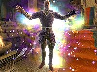
SI-Sheogorath Changing.jpg
When I saw this picture, I thought "Now, that's a great picture!". The lighting effects are very unique and interesting. The quality is very good, as well. I nominate this photo.
- Support: as nominator.--Iamgoofball 00:27, 2 June 2011 (UTC)
- Oppose: The picture is pure awesome, just way too much of a potential spoiler to have on the front page, I think. I would be bummed if I clicked this picture and basically ruined the plot of SI for myself. =/ Weroj 02:57, 2 June 2011 (UTC)
- Support: This is again bringing up the issue that people had over Akatosh's image, an issue that I think is almost non-existent. The front page clearly warns people about spoilers, and to anyone who takes the warning to heart and doesn't click the image it's just a picture of Sheogorath getting sparkly. I love the lighting effects, but this vote is more about supporting "spoiler images" in general than the specific image. Legoless 15:47, 2 June 2011 (UTC)
- Support: Per Legoless.--Ghurhak gro-Demril or TAOYes? 21:55, 9 June 2011 (UTC)
- Support: It's a good image and deserves to be recognized. --GKtalk2me 00:27, 10 June 2011 (UTC)
OB-npc-Hunting Tail.jpg
I happened to see this image while looking for information on a query and immediately thought "Ooh - that's a nice image; I hope it's one of mine", only to be slightly miffed that it was from Dwarfmp instead. Any image that makes you stop and take a second look has to be worthy of a vote.
- Support: as nominator. rpeh •T•C•E• 22:53, 1 June 2011 (UTC)
- Oppose: It's a good image, but nothing really separates it from any other standard NPC shot. Doesn't catch my eye that much either, although the lighting is nice. Legoless 23:19, 1 June 2011 (UTC)
- Neutral: Thanks, again. I wouldn't myself say it's an awesome shot, but of course I agree it's nice. As the author I'll just neutral it, I just wanted to say thanks. ~ Dwarfmp 00:21, 2 June 2011 (UTC)
- Oppose: Good, but nothing special. Maybe if he were hunting deer or some type of pose... but he's just standing there. Elliot (talk) 02:29, 2 June 2011 (UTC)
- Support: I'll just quote Dlarsh: "Even anonymous NPCs deserve some love" --Krusty 23:22, 7 June 2011 (UTC)
- Oppose: I have to agree that it's nothing special. I don't think it's FI quality. --GKtalk2me 00:25, 10 June 2011 (UTC)
- Comment: Actually, there are three Opposes and two Supports. Therefore, Consensus is Oppose.--I a m g o o f b a l l--Need Something? Drop by on my Talk Page. What I've done for this site. 00:27, 10 June 2011 (UTC)
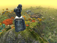
File:SI-place-Mount Sheogorath Summit.jpg
A magnificent view overlooking New Sheoth to the Southeast, the madly heart of the Shivering Isles. To the South the swamps of Dementia lie sprawling, appearing almost hospitable in the morning Sun.
- Support, as nominator. This image once again possesses that irresistible trifecta of foreground, background, and light play. Need I say more? - Neural Tempest 10:36, 24 May 2011 (UTC)
Support: Yes, I like it. Good view, good lighting, and it looks awesome as a thumbnail too, good show I say. — Unsigned comment by Dwarfmp (talk • contribs)- I just noticed, there's a Khajiit hiding next to the statue, this obviously being the player, and I don't think it is then eligible, despite it being a great image. So I withdraw my support. I think more people should say what they think about this ~ Dwarfmp 22:13, 29 May 2011 (UTC)
- Comment: I don't really care about the Khajiit- if anything, it merely provides some scale that makes the statue appear even more impressive. My problem is that I would really love to see this same basic shot, except tilted upwards at night instead of downwards during the day. The Shivering Isles has an amazing nighttime skybox in clear weather and I would love to see an image showing off both it, the statue, and maybe New Sheoth as well. But it would be irritating if such an image got shot down because this shot was already in the FI. I don't really think that the presence of similar images in the FI is a good reason to black-ball a nomination, but some might feel that way. So based on my apprehension that a hypothetical detractor may rouse hypothetical opposition to a hypothetical image because this beautiful picture had already been voted in to the FI, I'm hesitant to vote for it. Minor Edits 11:13, 31 May 2011 (UTC)
- I agree that the Khajiit provides scale, in fact I didn't know it was that big before I saw him. I was merely under the impression that shots with the player visible aren't to be used on the site, which I think makes sense. Anyhow, since few people are voting, and the majority being support as of now, I guess we can expect this to become featured, despite the Khajiit, which I'm totally fine with. As for the night shot, one could be uploaded as a separate image, so supporting this image wouldn't leave out that possibility. ~ Dwarfmp 16:37, 31 May 2011 (UTC)
- Support: I think it is a beautiful shot and I tend to agree with Minor Edits; the Khajiit (or whatever it is) adds a bit of scope to the statue and the surroundings. Yep, it would be interesting to see the shot at night (is it me, or do we have a tendency to avoid night time shots?) of the same motif, but I think this daytime version deserves time on the Main Page. --Krusty 11:32, 31 May 2011 (UTC)
- Support: Pretty good image. As some people pointed out there are ways to improve this picture, but it is quite good as it is. --AKB Talk Cont Mail 16:54, 31 May 2011 (UTC)
OpposeSupport: The cat ruins it. Playable characters or HUD displays should be immediate disqualifications. Elliot (talk) 00:35, 1 June 2011 (UTC) Changed per removal of said cat. Elliot (talk) 02:31, 2 June 2011 (UTC)Oppose: I also don't like the player character being in the screenshot, size comparison or not.Legoless 17:23, 1 June 2011 (UTC)- Comment: I've uploaded a different version, without the Khajiit. If people prefer the previous version, feel free to revert, but it should take care of the objections here. rpeh •T•C•E• 17:48, 1 June 2011 (UTC)
- Interesting, you captured the same angle almost perfectly. I have to say, I like the contrast in the previous version better (made it looks more realistic), but I see more plants (or rather the mushroom thingies) in your new version. I was thinking though, perhaps a creature could be captured in the shot to show the statue's true height? Or maybe a summoned Golden Saint if luring a creature there is too hard. 'Tis merely a suggestion though, I don't recall having been near the statue myself, I don't know if there are any creatures close to it. ~ Dwarfmp 18:30, 1 June 2011 (UTC)
- Support: Another example of an image that will look great on our front page. --GKtalk2me 00:21, 10 June 2011 (UTC)
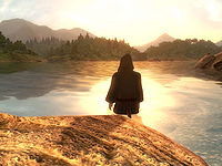
File:OB-quest-Alteration Training.jpg
Found this while going through all the quests. Made me want to go swimming.
- Support as nominator. Datacaust 05:58, 24 May 2011 (UTC)
- Neutral(hopefully temporarily) I was thinking of suggesting this myself when I nominated File:MW-place-Lake Masobi.jpg, but upon examining it, the only noteworthy feature is the glare from the sky and water. The back of Tooth-in-the-Sea's robe is not the best centerpiece, and even the forts in the distance are bland. Additionally, one-fifth of the image is the large rock (23%, nearly a quarter), taking away from the possibility of a more impressive shot of the lake and trees. If the image could be taken again, with more eye-catching tidbits, and less rock, I'd be all for it.- Neural Tempest 06:32, 24 May 2011 (UTC)
- Support: A perfect example of Oblivion's lighting effects, this is one of the images that reminds you of the beauty of Cyrodiil. --AKB Talk Cont Mail 07:06, 24 May 2011 (UTC)
- Support: No doubt whatsoever, this is an image of incredible beauty - definitely one of my favorite shots on the entire site. --Krusty 09:39, 24 May 2011 (UTC)
- Support: This is a nice picture, not much more to add than that. Also, the light shines right on Tooth-in-the-Sea, making him that much more.. mystique or something similar. Though it may have been better without the rock in the front, I don't think it really bothers at all ~ Dwarfmp 11:23, 24 May 2011 (UTC)
- Support: An amazing shot- one I'd forgotten about. In fact, rpeh should make a page of his own images that he likes that I can shuffle through anytime we need something new! ;) --GKtalk2me 19:59, 24 May 2011 (UTC)
- Support: That is the best Argonian bathroom I've ever seen. Minor Edits 00:22, 26 May 2011 (UTC)
- Support: The silhouette is nice. And the implication of what is going to happen makes it inviting. Elliot (talk) 00:35, 1 June 2011 (UTC)
- CONSENSUS: SUPPORT --Krusty 23:51, 7 June 2011 (UTC)
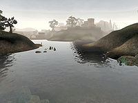
File:MW-place-Lake Masobi.jpg
As much as I do enjoy Oblivion's imagery, I felt it was stealing the show. So, to make things even, I carefully sifted through Morrowind's Images, and dug up this treasure. It's just about the best scenic shot, and has decent detail in the foreground, midground, and background, along with mid-morning haze that adds a level of mystique to the picture. Simply put, it is worthy of a postcard. As a bonus, it just happens to have been uploaded by a well-known editor.
- Support as nominator. If an image gives you the urge to jump into it, it's probably not half bad. - Neural Tempest 05:27, 23 May 2011 (UTC)
- Support That annoying water ripple effect does look damn fine in screenshots. =) Weroj 06:30, 23 May 2011 (UTC)
- Support: An awesome image; it really showcases the overlooked graphic beauty of Morrowind. --GKtalk2me 18:59, 23 May 2011 (UTC)
- Support: An excellent Morrowind image. --AKB Talk Cont Mail 07:06, 24 May 2011 (UTC)
- Support: I actually think there are better MW images out there, but this one's good enough to qualify. rpeh •T•C•E• 07:52, 24 May 2011 (UTC)
- Comment When it comes to scenic shots from Morrowind, the only other two that match up are the two of Vivec (place) stashed away in your photo category. I could always add (one of)them to the voting list here, if wanted. - Neural Tempest 08:48, 24 May 2011 (UTC)
- Those aren't valid for here because they aren't used on an article. This, this, this and this are all valid though. rpeh •T•C•E• 09:03, 24 May 2011 (UTC)
- Of those, I was already seriously considering the netch, being a leader by far in the creature department, but the others aren't too shabby. When it comes to image nominations, is there a limit per person? I'm asking this because over the past two days, I've found at least 5 decent Morrowind images (including the breeding netch), and 3 pictures from Oblivion. I don't want to put up too many at once, seeing as we already have a bit of a backlog. - Neural Tempest 09:28, 24 May 2011 (UTC)
- There's no limit, but use your own judgement. I nominated several images to get the ball rolling, but nowhere near as many as I have in my list. Once the early enthusiasm is over, things will probably slow down a bit and then it's time to roll out the images that have been kept in store. Having three to five ongoing votes is probably enough. rpeh •T•C•E• 09:32, 24 May 2011 (UTC)
- Of those, I was already seriously considering the netch, being a leader by far in the creature department, but the others aren't too shabby. When it comes to image nominations, is there a limit per person? I'm asking this because over the past two days, I've found at least 5 decent Morrowind images (including the breeding netch), and 3 pictures from Oblivion. I don't want to put up too many at once, seeing as we already have a bit of a backlog. - Neural Tempest 09:28, 24 May 2011 (UTC)
- Those aren't valid for here because they aren't used on an article. This, this, this and this are all valid though. rpeh •T•C•E• 09:03, 24 May 2011 (UTC)
- Comment When it comes to scenic shots from Morrowind, the only other two that match up are the two of Vivec (place) stashed away in your photo category. I could always add (one of)them to the voting list here, if wanted. - Neural Tempest 08:48, 24 May 2011 (UTC)
- Question: The shadow near the center, on the water confuses me, it looks like it's the shadow from a tall building, though it seems to appear from nowhere. Is that just me? ~ Dwarfmp 11:23, 24 May 2011 (UTC)
- Support: I love Morrowind's water. Minor Edits 00:22, 26 May 2011 (UTC)
- Oppose: Not very colorful. Datacaust 22:07, 29 May 2011 (UTC)
- Support: An impressive image for a game with underrated graphics. Dlarsh(T,C) 15:32, 31 May 2011 (UTC)
- Support: Ascadian Isles. <3 Legoless 19:19, 31 May 2011 (UTC)
- Support: It is a very beautiful image and has a certain nostalgia to it Honda1996 3:27 pm, 31 May 2011
- Oppose: Yawn. It's pretty, but there are better ones that could be taken. Elliot (talk) 00:35, 1 June 2011 (UTC)
- CONSENSUS: SUPPORT --Krusty 23:51, 7 June 2011 (UTC)
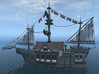
OB-quest-An Unexpected Voyage.jpg
It's a friggin' ship! 'Nuff said.
- Support as nominator and someone hoping the things actually move in Skyrim. Minor Edits 00:05, 23 May 2011 (UTC)
*Support: It is a nice enough picture, it surely deserves a chance on the front page a year from now when the current backlog of featured images is taken care of. --AKB Talk Cont Mail 00:13, 23 May 2011 (UTC)
- Oppose: There's nothing special enough about this image that it stands out to me as deserving of special recognition. --GKtalk2me 18:57, 23 May 2011 (UTC)
- Oppose: On further consideration, GK is right. --AKB Talk Cont Mail 07:06, 24 May 2011 (UTC)
- Oppose: It's a good location shot but not a spectacular one. rpeh •T•C•E• 07:51, 24 May 2011 (UTC)
- Oppose: This image isn't much compared to the other nominations. I believe there are quite a number of better ones out there, and certainly with the multitude of featured ones, this image is best not to become part of it. ~ Dwarfmp 11:23, 24 May 2011 (UTC)
- Support: It's a simple, clean picture with clear blue colours and a nice transition from water to sky. A brisk, almost cheery scene! Weroj 12:53, 24 May 2011 (UTC)
- Oppose: Nothing special about it. mxk101Talk 22:16, 24 May 2011 (UTC)
- Oppose x2(Or just Oppose): It's an ugly picture of a boat, that's all. I REALLY think we should De-nominate this.--Iamgoofball 15:42, 31 May 2011 (UTC)
- Oppose: Nothing too outstanding here. It is unique, but that's not enough to really get it FI status. Elliot (talk) 00:35, 1 June 2011 (UTC)
- CONSENSUS: OPPOSE --Krusty 23:51, 7 June 2011 (UTC)
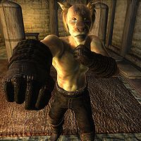
OB-npc-J'Ghasta.jpg
A great action shot which caught my attention. Some 'attack' screenshots come out looking goofy, but I think this one looks well.
- Support: As nominator. Legoless 21:07, 12 May 2011 (UTC)
- Support: One of the best NPC images on the Wiki. --Krusty 23:03, 12 May 2011 (UTC)
- Support: I'd somehow never seen this before... It's awesome! --GKtalk2me 23:10, 12 May 2011 (UTC)
- Neutral: Thanks, I took this one. As I've seen other photographers here neutral on their own image, I'll do that too. I was very pleased with this one, but to be honest, I think it lacks a bit of color. I believe I improved making screenshots since then, and I also edit my images better. I can upload a more colorful version of this one if you guys think that's the right thing to do ~ Dwarfmp 23:35, 12 May 2011 (UTC)
-
- Making it just a bit brighter would only improve it. --74.190.114.87 00:24, 13 May 2011 (UTC)
- Support: Bad kitty! No! Someone grab the water sprayer! Minor Edits 01:52, 13 May 2011 (UTC)
- Comment: The perspective seems wonky to me. I don't know what's up with his hand, but it's too big compared to the rest of him.--Ghurhak gro-Demril or TAOYes? 08:46, 13 May 2011 (UTC)
- Support: It's a great shot - the perspective is what makes it great. It would be perfect it he was looking into the camera instead of just off to the right, but it's still a superb shot. rpeh •T•C•E• 08:57, 13 May 2011 (UTC)
- Support: This is one of the better action shots we have, and the lateral lighting really shows the contours. I would however agree with Rpeh in saying the eyes could be aligned better, and I also think J'Ghasta could be a bit more centered in the frame. If this image could be made better, I don't see how it could hurt. It was produced once, so it can also be reproduced. It would just take some dedication, and the PC version of the game (which gives me an excuse not to take the shot myself). Even if it's not changed, I still like it, and we could always say "It's designed to make the audience ask, 'What's he looking at?', truly a thought-provoking piece." I guess I'm good with excuses today, - Neural Tempest 09:19, 13 May 2011 (UTC)
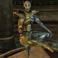
MW-creature-Vivec.jpg
I like this image of Vivec, really that's about all I have to say.
- Support: A great shot of the most interesting-looking NPC in any TES game. The floating, the Chimer/Dwemer split, that crazy look in his eyes, ect. Minor Edits 06:23, 12 May 2011 (UTC)
- Support: Pretty great shot there! What makes it great is the fact that Vivec is looking striaght down the barrel of the "camera". JackTurbo95 13:22, 12 May 2011 (UTC)
- Support: I've played Morrowind just a little bit and never got to see him in person. But as far as I'm concerned, the quality and angle is great, it seems to do him justice. ~ Dwarfmp 14:58, 12 May 2011 (UTC)
- Oppose: I think an image of Vivec could be done better. The Chimer/Dwemer split isn't very well shown. --GKtalk2me 23:02, 12 May 2011 (UTC)
- Comment: I don't think he's part Dwemer... Do you mean "Dunmer"?--Ghurhak gro-Demril or TAOYes? 08:43, 13 May 2011 (UTC)
-
- I'm pretty sure she meant Dunmer ~ Dwarfmp 11:33, 13 May 2011 (UTC)
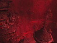
MW-place-Dagoth Ur.jpg
I just noticed that we have yet to have a Morrowind image win an election so I'd though I would nominate a few to give them another chance to be featured. But anyway, this image is both alien and unusual due to the Dwemer Architecture on display here, Dagoth Ur (Place) is built across multiple levels throughout the crater of Red Mountain, and I've always loved how the end result looks. The blight storm also happens to make this image look intimidating, the image truly captures the dangers of Red Mountain and of Dagoth Ur due to these traits. It is quite simply an excellent image. --AKB Talk Cont Mail 02:56, 12 May 2011 (UTC)
- Oppose: It is a good image , but I just don't really like the red sort of "mist". Maybe one after the blight will be better... JackTurbo95 13:27, 12 May 2011 (UTC)
- Oppose: I'm not sure about the quality, but anyway, the red mist makes EVERYTHING red and kind of monotonous. Yes that's how it looks in the game, and most likely just how it's supposed to, but I wouldn't consider it FI material ~ Dwarfmp 14:58, 12 May 2011 (UTC)
-
- Comment: We do have a post blight image of the Dagoth Ur facility here, and quite honestly I dislike it. It is a decent enough picture and everything but like most things in the Vvardenfell Ashlands, it is grey and boring. Honestly the blight storm makes the scene seem appropriately apocalyptic. --AKB Talk Cont Mail 23:04, 12 May 2011 (UTC)
- Support: Meh. It's not mind-blowing, and the quality looks a little iffy as a full image, but I don't think it can get any better and it would add some diversity to the FI. Minor Edits 08:17, 17 May 2011 (UTC)
- Support: It'll look good on the main page. Also, I quite like the mist, for the record.--Ghurhak gro-Demril or TAOYes? 15:38, 20 May 2011 (UTC)
OB-place-The Temple of the One.jpg
This image is beautiful because it is simple and symmetric. The detail within the image is also a thing to love.
- Support as nominator. Elliot (talk) 05:22, 11 May 2011 (UTC)
- Support: As with all images taken by User:Rev3rsix it is impossibly beautiful, definitely deserves to be featured. In fact I'd recommend going through that user's edit history and nominating all submitted images for featured status, they are all just that good. --AKB Talk Cont Mail 05:58, 11 May 2011 (UTC)
- Support: Per all above.--Ghurhak gro-Demril or TAOYes? 11:14, 12 May 2011 (UTC)
- Oppose Once again, a fake - a beautiful fake, but still a fake. --Krusty 15:12, 12 May 2011 (UTC)
- Support: It'll look great on the Main Page. --GKtalk2me 22:47, 12 May 2011 (UTC)
- Support: This would indeed look great on the main page, but would look even better as a two image set, with a corresponding night shot, showcasing that trademark Oblivion night sky. I don't see anything about this image that makes it so horribly fake it becomes unworthy of acknowledgement, it's got my approval. It actually really reminds me of a Renaissance painting of an ideal city by Piero della Francesca in the Palazzo Ducale at Urbino, Italy. - Neural Tempest 23:24, 12 May 2011 (UTC)
- Neutral: Stupid hobo wandered into the shot. Kind of threw off the whole symmetry thing for me. And I don't really know how it's "fake," but there's that to consider. But, meh, seems to be a consensus in support of it, so I'm pulling a Switzerland. Minor Edits 08:17, 17 May 2011 (UTC)
OB-Bruma-01.jpg
This is a great angle for the city of Bruma. Everything is captured along with the snowy mountains. The angle lessens the obtrusive impact the chapel has and makes it look like a city.
- Support as nominator. Elliot (talk) 05:22, 11 May 2011 (UTC)
- Support: As with all images taken by User:Rev3rsix it is impossibly beautiful, definitely deserves to be featured. In fact I'd recommend going through that user's edit history and nominating all submitted images for featured status, they are all just that good. --AKB Talk Cont Mail 05:58, 11 May 2011 (UTC)
-
- Most of them are pretty amazing. I just went through and picked the ones that stuck out to me. Definitely feel free to nominate more. Elliot (talk) 06:04, 11 May 2011 (UTC)
- Oppose- wrong format. I realize they are pretty, but they are fake. --Krusty 16:57, 11 May 2011 (UTC)
- Question: So it is not good enough to grace the front page, but it is nice enough to be used on Oblivion:Bruma? Where exactly do we draw the line for when a modified image is appropriate or not? --AKB Talk Cont Mail 17:21, 11 May 2011 (UTC)
- To be honest, I don't like any of them - on any page. There was a discussion about it, but I can't find it... :( EDIT: Talk is here. --Krusty 17:25, 11 May 2011 (UTC)
- Not one thing says they cannot be included in an article. "Although there are no fixed rules for image sizes or exactly what an image contains...". GK says "You can add your panoramic images further down". Rpeh just says he shouldn't use them to update images. Not one place/person says they are bad images or they cannot be used. You also call them fake... but images all around the wiki have been altered, so why is this such a big deal? I'm sorry if I don't understand your logic... Elliot (talk) 02:19, 12 May 2011 (UTC)
- Look, we recently deleted this image because it was modded – I really don’t see any difference here. Sure, they are pretty to look at, but it IS a fake! That was my participation in this debate, make of it what you want. --Krusty 06:27, 12 May 2011 (UTC)
- Not touching this one with a 10-foot pole. I mean, I wouldn't be able to type legibly with the 10-foot pole anyways. Minor Edits 08:17, 17 May 2011 (UTC)
- Look, we recently deleted this image because it was modded – I really don’t see any difference here. Sure, they are pretty to look at, but it IS a fake! That was my participation in this debate, make of it what you want. --Krusty 06:27, 12 May 2011 (UTC)
- Not one thing says they cannot be included in an article. "Although there are no fixed rules for image sizes or exactly what an image contains...". GK says "You can add your panoramic images further down". Rpeh just says he shouldn't use them to update images. Not one place/person says they are bad images or they cannot be used. You also call them fake... but images all around the wiki have been altered, so why is this such a big deal? I'm sorry if I don't understand your logic... Elliot (talk) 02:19, 12 May 2011 (UTC)
- To be honest, I don't like any of them - on any page. There was a discussion about it, but I can't find it... :( EDIT: Talk is here. --Krusty 17:25, 11 May 2011 (UTC)
- Question: So it is not good enough to grace the front page, but it is nice enough to be used on Oblivion:Bruma? Where exactly do we draw the line for when a modified image is appropriate or not? --AKB Talk Cont Mail 17:21, 11 May 2011 (UTC)
- Support: I'm really split over these images. I think they look great, but I really hate them for the wiki because they don't fit our image standards. Given the amount of effort we've put in to get consistent image sizes to ensure that pages look as similar as possible, these extra-wide images really stick out. The way wiki handles thumbs makes them look odd too. They do look good though. It's worth saying that they aren't really modded either. As I understand it, just one console command was used to change the field of view. For most of my action NPC and quest shots I've had to mess around with tcl, tai, tfc and other things like lighting, so they're actually more fake than these. On balance I'll support these images, but it's a close-run thing. rpeh •T•C•E• 06:47, 12 May 2011 (UTC)
- Support: I support this simply for the fact that you can see Regner lounging outside his house. That detail, combined with the entire city in one view, makes this an intriguing picture. The featured images are supposed to be both thought-provoking and aesthetically pleasing, and this image fits both criteria. I don't see how it's modified to the point where it's a bad representation, because it seems astoundingly accurate. All imagery is taken straight from the game, which is acceptable to me. Perhaps in future, stricter definitions should be introduced for "modified" or "fake" images, particularly for featured works. Anyways, I like it.- Neural Tempest 07:04, 12 May 2011 (UTC)
- Question: Where can you see Regner? Cause I can't see it mate...JackTurbo95 14:04, 12 May 2011 (UTC)
- If you look at the picture in its full size, you can vaguely see someone sitting on the left, behind the chapel. Of course we all know it's Regner, who sits there all the time ~ Dwarfmp 14:58, 12 May 2011 (UTC)
- I just can't see. I've looked until I got a headache , and all I can really see is what I think is a bench... JackTurbo95 18:41, 12 May 2011 (UTC)
- Just for clarification, I copied the image into Paint, in Windows, and Regner's head is at coordinates (433,712). Seeing as the image is 2400 by 1169 pixels, that's about three-fifths of the way down, and one sixth of the way across. It might also help to go into the game and spot him there, so you know exactly where to look. Don't forget, you might not be seeing the image at full size. At anything less than full size, I can't see him either, but he's sitting casually, just like always! It would have been nice if there were more people roaming the streets, but it's still a nice bonus. - Neural Tempest 22:54, 12 May 2011 (UTC)
- I just can't see. I've looked until I got a headache , and all I can really see is what I think is a bench... JackTurbo95 18:41, 12 May 2011 (UTC)
- If you look at the picture in its full size, you can vaguely see someone sitting on the left, behind the chapel. Of course we all know it's Regner, who sits there all the time ~ Dwarfmp 14:58, 12 May 2011 (UTC)
- Question: Where can you see Regner? Cause I can't see it mate...JackTurbo95 14:04, 12 May 2011 (UTC)
- Oppose: The holes in the terrain look bad. While it's a nice view of the entire city, it isn't top quality. I'm also slightly concerned with modded images, but panoramics are okay in my opinion (after all, isn't that what all our maps are?). Legoless 15:50, 12 May 2011 (UTC)
- Support: I love these images; I was pretty adamant that they not be used at the top of our articles because it ruins the consistency, but this image doesn't depict anything that's not there in the game. --GKtalk2me 22:35, 12 May 2011 (UTC)
- Support: Beautiful. I don't really mind the fact that it's not a simple one click screenshot, as it's still an accurate depiction of the town (the proportions seem to be right, there's nothing there that isn't there in the actual game, the colours haven't been photoshopped, etc). Weroj 02:19, 20 May 2011 (UTC)
SI-npc-Sheogorath Cane.jpg
This is an excellent action shot of Lord Sheogorath, definitely deserves to be featured in my opinion.
- Support: Wow, an image I took :P. I wouldn't say this is the best image I've uploaded so far, or that I can even be objective as saying this is FI material, but naturally I support it. I uploaded this particular one to show Sheogorath's cane in detail, now you can clearly see a bloody eye on the top of it. Sheogorath also looks straight at the camera with a big smile, as if showing off to the viewer. I'm curious what others think of this image. Oh and thanks for nominating this AKB ~ Dwarfmp 19:08, 10 May 2011 (UTC)
Oppose: It's a great image and all, but it doesn't look nearly as good as a thumb, which is how it would be presented on the main page were it granted FI status. --GKtalk2me 19:13, 10 May 2011 (UTC)
- Oppose: Not the best of shots there. I don't really like this one. JackTurbo95 17:02, 11 May 2011 (UTC)
- Support: This is a great picture of Sheogorath. Thumbnails in general look pretty crappy compared to the full-size image, so I don't consider that to be a problem. It also shows his cane in detail, something which you can't properly do in-game. Legoless 17:11, 11 May 2011 (UTC)
- Support:, Much better as a square image - almost good enough for the NPC page, but Dwarfmp is responsible for that one anyway, so we'll see. --Krusty 18:56, 11 May 2011 (UTC)
- Support: "Being a good thumbnail" is not a requirement for an image, so lacking that should never be the sole reason to oppose a vote. Doing so is just silly and pedantic. It's a great image. Period. Elliot (talk) 02:15, 12 May 2011 (UTC)
Oppose: It's a nice image, but it would work better if it were square, because it would make Sheogorath appear larger on the thumb. I take the point about thumbnails not being the be-all and end-all of the decision, but in this case since a simple change would fix the problem, it's worth saying "no" for now.rpeh •T•C•E• 06:41, 12 May 2011 (UTC)
-
- Comment: I've uploaded it as a 4:3 because I thought that was custom, as opposed to a square one for the introduction pic. It would look better square I agree, I can re-upload it if you want. ~ Dwarfmp 11:55, 12 May 2011 (UTC)
-
- Reply: I think that would switch at least three "oppose" votes. Please upload a new image then we can call this vote closed and start a new one. One good thing about not having any fixed rules yet is that we can do stuff like this without complaint :) In any case, I think it's fair enough to immediately relist an image after specific concerns are addressed. rpeh •T•C•E• 00:02, 13 May 2011 (UTC)
- Support: The image looks much better as a thumb, now, and that was the only reason I opposed it. I like it! :) --GKtalk2me 00:38, 13 May 2011 (UTC)
- Support: My, what a pretty stick. Minor Edits 08:17, 17 May 2011 (UTC)
- Oppose: It's a cool pose, but I don't like the angle. It should be possible to get a better shot of him showing off his mad stick skills. Weroj 02:19, 20 May 2011 (UTC)
OB-place-Imperial City.jpg
This is an image I always do a double take with. The view of it is a unique one, and the forts, ruins, and town in the background just complete the image.
- Support as nominator. Elliot (talk) 04:53, 11 May 2011 (UTC)
- Support: However, it appears to have been taken with RAEVWD, so I'm slightly worried about it not being a perfect representative of what the game looks like from a vanilla stand point. But still, I like pretty pictures... --AKB Talk Cont Mail 05:58, 11 May 2011 (UTC)
- Support: I remember asking rpeh how he took this picture. Definite support from me. --Rigas Papadopoulos • Talk • Deeds • 06:15, 11 May 2011 (UTC)
- Support: Pretty amazing shot there! JackTurbo95 11:47, 11 May 2011 (UTC)
- Comment: Another of mine, so I'm not going to vote, but I have to come clean and confess that this uses 3rd party mods. First, the shot itself is only possible with RAEVWD, and second there's a couple of buildings from one of the Unique Landscapes just visible on the Imperial Isle to the northwest of the city. RAEVWD isn't really cheating, and the buildings are scarcely noticeable, but I thought I should mention them.
- Support: Love this one; it reminds me of the opening credits of Oblivion. --GKtalk2me 22:31, 12 May 2011 (UTC)
- Support: What a great city ... would've been a lot greater with levitation, of course. Minor Edits 08:17, 17 May 2011 (UTC)
- Oppose: Unless the poster above pointed out that there are buildings from a mod in there, I doubt I could tell, but that is totally uncool and voids any merit the image has as a depiction of a place in vanilla Oblivion. It is a pretty picture, though, if a bit blurred out in full size. Weroj 02:19, 20 May 2011 (UTC)
OB-Avatar of Akatosh.jpg
A great single-shot of the climactic moment of Oblivion
- Support: I'd imagine that it might look slightly better if it was taken from another angle so we weren't looking directly at the Time Dragon's feet. However, it is still a great shot. --AKB Talk Cont Mail 19:01, 1 May 2011 (UTC)
- Comment: Actually, I rather liked the fact that the feet were closest. It seemed to point out to me the scale, and the fact that the character is looking up at the avatar. --GKtalk2me 20:26, 4 May 2011 (UTC)
- Oppose: I'm scared of spoilers. Oblivion is pretty old, and I imagine it's an extremely slim chance someone will visit the UESP and see this who doesn't already know the ending. Even slimmer that they will take notice. I'm most likely being a stick in the mud over nothing. Still, this pic encapsulates the climax of the game. That's part of what makes it great, but it's also the reason I'm disinclined to see it featured. Better safe than sorry imo. Minor Edits 03:31, 5 May 2011 (UTC)
- Comment:The general disclaimer covers this already. No need to worry about spoilers. --AKB Talk Cont Mail 04:46, 5 May 2011 (UTC)
- Comment: Lol, I'm more concerned about courtesy than I am about liability. That would be one hell of an emotional distress claim, anyways. Minor Edits 05:02, 5 May 2011 (UTC)
- Comment:The general disclaimer covers this already. No need to worry about spoilers. --AKB Talk Cont Mail 04:46, 5 May 2011 (UTC)
- Oppose: I know the disclaimer covers spoilers, but I have to agree with Minor Edits. It will really ruin someone's experience of Oblivion if they go at the main page and find this. --Rigas Papadopoulos • Talk • Deeds • 07:16, 10 May 2011 (UTC)
- Comment: Perhaps we could have the best of both worlds. Encapsulate it in a spoiler box with a collapsible/collapsed class, and have a one-line reason below it saying "Main Quest Sensitive". This would keep the image and normal description hidden from fresh players, while still making it fully accessable. Honestly, I could do this in 10 minutes with a hidden table, fully customized. - Neural Tempest 10:17, 10 May 2011 (UTC)
- Comment: I disagree... for one thing, we've never been concerned about spoilers. For another, how would a person unfamiliar with Oblivion gather the ending from this single image? It doesn't explain what's going on. It doesn't seem like a spoiler at all to me. --GKtalk2me 17:01, 10 May 2011 (UTC)
- Comment: I agree with GK, we are not concerned with spoilers, if you managed to guess that this picture was involved with the end of Oblivion's main quest than you either already completed the main quest, or you read about the ending. Either way it hurts no one by featuring it. --AKB Talk Cont Mail 17:07, 10 May 2011 (UTC)
- Comment: I disagree... for one thing, we've never been concerned about spoilers. For another, how would a person unfamiliar with Oblivion gather the ending from this single image? It doesn't explain what's going on. It doesn't seem like a spoiler at all to me. --GKtalk2me 17:01, 10 May 2011 (UTC)
- Comment: Perhaps we could have the best of both worlds. Encapsulate it in a spoiler box with a collapsible/collapsed class, and have a one-line reason below it saying "Main Quest Sensitive". This would keep the image and normal description hidden from fresh players, while still making it fully accessable. Honestly, I could do this in 10 minutes with a hidden table, fully customized. - Neural Tempest 10:17, 10 May 2011 (UTC)
- Support: The only problem I have with the image itself is the rather mundane background. If a slightly wider field of view was given, the Avatar's apparent size would be that much more imposing. As it is, the masonry is the only hint about the scale. The Avatar is well-shot in this version however, allowing viewers to identify the form more easily than the previous two versions, which matters more at the thumbnail size. As for the "spoiler" issue, it's only minor, because most players would still be suprised by the scene in-game, or have already seen it. I did propose a work-around for those few anti-spoiler hardliners, so I fully support this image being featured on the Main page. (Then again, a little part of me wants this on the Oblivion Main Page, oh well...) - Neural Tempest 04:05, 11 May 2011 (UTC)
- Oppose: I think it is important that we don't associate "important events" in a game with being a "great image". Also, the image quality is rather astonishingly poor: it seems pixelated and just rather awkward (who wants to look at feet?). Another thing we should try to avoid is judging it on its thumbnail or judging it based on content (what the shot is of). An image isn't taken to be viewed as a 350px square. It is taken to be viewed in its full size. Also, getting all freaked over spoilers is aimless; it is clear that the wiki doesn't burden itself with censoring them. Elliot (talk) 04:47, 11 May 2011 (UTC)
-
- Comment: The very nature of the wiki means it's policy can't include spoiler concerns, but its demands for relevancy naturally limit them anyways, and in that way people who haven't finished Oblivion can avoid most spoilers by being careful. But being careful may not help them when it comes to whatever happens to be on the main page. Making this judgment purely on the artistic and technical merit of the image seems to be your approach to voting, and that's fine, but it's hardly "aimless" for others to consider the context surrounding how the picture will ultimately be presented. The aim is merely different: your apparent aim is that people vote based on an image's intrinsic value as a piece of art, while the other is that we should do so while keeping in mind how the promotion will be perceived by its audience. Neither is wrong, although honesty I don't really understand your contention that an image's merit can and should be separated from how it will be perceived and the themes and memories likely to be associated with it. Minor Edits 02:30, 12 May 2011 (UTC)
-
- The spoilers subject is so old and beaten to death I hate even acknowledging it. And as for your thoughts on the thumbnail issue: images are not thumbnails. To hammer one for that sole reason is rather shallow; also, some images look great as thumbnails because their imperfections are smashed together. Are we to promote those images because they will be [falsely] perceived as good images?
- Voting on an image on anything but its intrinsic value is pointless. I think some people should go look over at Wikipedia to see how they deal with images. Elliot (talk) 02:52, 12 May 2011 (UTC)
-
-
-
-
- Comment: I didn't mention thumbnails, though I can understand the reasoning of those that did; after all, the thumbnail version of an image is likely to be viewed far more times than the picture itself. In regards to what wikipedia has to say, there is obviously no basis for concern about spoilers in Wikipedia's featured pictures; there's nothing to potentially spoil. The pool of things to consider in the two assessments are logically different, the audience and their concerns are different, and whatever guidance Wikipedia could offer for their feature pictures section has to be assessed in light of these facts. And I would think it pointless to argue that an image can even have value outside the eye of the beholder and what it evokes in him/her. That is, after all, why most if not all art is created, to convey meaning and trigger reactions. An artist who never considered what sort of response he/she was hoping to elicit in a work would likely be a very bad artist. Anyways, my ultimate point is that the idea that a piece of art can actually be assessed in a vacuum free of context and without associating it with other things is fiction. Minor Edits 04:18, 12 May 2011 (UTC)
-
-
-
-
-
-
-
-
- You're getting way off base here. This isn't an artist convention or anything of the sort. We are discussing whether the thumbnail of an image should be taken into consideration when judging the overall value of an image. It should not. Judging in image by a reduced resolution, regardless of the amount of times it may be viewed in such a state, is pointless.
Now as a wiki, we frequently replicate the successes of Wikipedia where appropriate. Figuring this is a new process for UESP, we should for now (I wasn't even trying to implicate spoilers in that link, by the way). Elliot (talk) 05:29, 12 May 2011 (UTC)
- You're getting way off base here. This isn't an artist convention or anything of the sort. We are discussing whether the thumbnail of an image should be taken into consideration when judging the overall value of an image. It should not. Judging in image by a reduced resolution, regardless of the amount of times it may be viewed in such a state, is pointless.
-
-
-
-
-
-
-
-
-
-
- Oh, I'm very much on base. Judging an image out of context is what's pointless, and that's what's being argued in your thesis sentence, that we shouldn't make any association between an image and the events its depicts.. The thumbnail is just one part of that overarching subject, as are spoilers concerns. The plain fact is that we're not just saying "Oh, I like that" if we vote for an image. We're saying, "Oh, I like that; put a thumbnail of it on the front page for all to see." And that legitimately carries with it some additional formatting and content concerns, beyond merely what we think of the image itself. Minor Edits 06:17, 12 May 2011 (UTC)
-
-
-
-
-
- Oppose: All that annoying debate killed the image for me. --Krusty 06:19, 12 May 2011 (UTC)
- Oppose: When I edit articles, I also try to reduce spoilers. I can see this would be quite sensitive. In any case, I think a better shot of this is possible. ~ Dwarfmp 15:05, 12 May 2011 (UTC)
OB-place-Frostcrag Planets.jpg
A beautiful night shot that brings to mind the enormity of the Elder Scrolls universe
- Support: I've always loved the beauty of Frostcrag Spire. Truly this shot displays just how pretty Tamriel can be. --AKB Talk Cont Mail 19:01, 1 May 2011 (UTC)
- Support: Fantastic. I've never seen Frostcrag look better. Minor Edits 19:45, 1 May 2011 (UTC)
- Neutral: I took the shot so I'm not going to vote yay or nay, but I wanted to make it clear I'm not just ignoring the discussion. — Unsigned comment by Rpeh (talk • contribs) at 20:39 on 1 May 2011 (UTC)
- Support: Beautiful. Just beautiful.--Iamgoofball 20:51, 1 May 2011 (UTC)
OB-npc-Etira Moslin.jpg
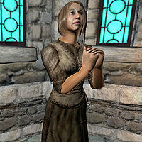
This image struck me the first time I saw it... something about the expression on her face.
- Support: The colours aren't quite perfect, but the pose is superb. rpeh •T•C•E• 20:34, 1 May 2011 (UTC)
- Support: It kinda made me think, "What in the world is that woman so fixated on?" The fact that it made me form an automatic, errr... thought? ... about it makes me fell it deserves to be a Featured Image. Kalis Agea 04:23, 2 May 2011 (UTC)
- Support: Amazing picture here. Very good shot of a NPC! JackTurbo95 08:05, 7 May 2011 (UTC)
MW-quest-Archmagister Gothren.jpg
A brilliantly colourful image showing off Morrowind's abilities to the full. It's also a good action shot.
- Support - The glowing testicles amuse me. Minor Edits 20:05, 23 April 2011 (UTC)
- Oppose: A bit too much is going on in this picture, it is hard to find any detail on it to focus on. --AKB Talk Cont Mail 20:09, 29 April 2011 (UTC)
- Oppose: I agree with AKB , too much going on in this picture to be on the main page. JackTurbo95 08:04, 7 May 2011 (UTC)
SI-npc-Belmyne Dreleth.jpg
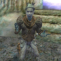
A perfect OBNPCRP image. This is a great, interesting, pose, with good colour and an interesting background.
- Support: The image catches one's eye immediately. Kalis Agea 20:17, 23 April 2011 (UTC)
- Support: The stance is perfect. This is definitely a shot that deserves to be recognized. --GKtalk2me 15:07, 24 April 2011 (UTC)
- Support: A great shot, the quality of this image really makes it stand out to me, if only all of our NPCs had these great action shots! --AKB Talk Cont Mail 20:09, 29 April 2011 (UTC)
- Support: That's right, kneel! Good, good. Now as soon as Zed gets here, the party will begin ... Minor Edits 04:58, 2 May 2011 (UTC)
- Support: Very nice picture! Need to give my vote , and I vote for this one. JackTurbo95 05:11, 2 May 2011 (UTC)
OB-quest-A Brush with Death 02.jpg
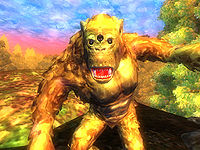
Stunning. They don't come much more colourful than this one. A really eye-catching image and a great action shot.
- Support I always liked this image as well. The brilliant, strong colors capture the surrealism of the Painted World perfectly. --Krusty 17:38, 23 April 2011 (UTC)
- (edit conflict) Support: Per nomination.--Ghurhak gro-Demril or TAOYes? 18:05, 23 April 2011 (UTC)
- Support: This one is awesome! JackTurbo95 19:51, 23 April 2011 (UTC)
- Support: This has been one of my favorite images on the wiki for several years now. There's no doubt it should be featured on the Main Page. --GKtalk2me 15:09, 24 April 2011 (UTC)
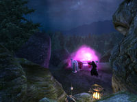
OB-quest-Necromancer's Moon.jpg
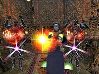
On 1 Jan 2008 I said on the talk page for this image that this was a brilliant image, and my opinion hasn't changed. Since it was the picture that first got me thinking about a FI process, I think it's only fair that it's the first image to be nominated.
- Support: It's an excellent image. You never truly notice the lighting effect spells have in-game, but this spooky night shot shows them off perfectly. Legoless 09:49, 23 April 2011 (UTC)
- Comment: While it's a good image, you can't really see the revenant-light shining on the altar. Is there any way to fix that while keeping the rest the same?
- Comment: Not really. I tried taking a shot myself, and if you get the explosion of the spell, it pretty much drowns out the Revenant light. This version is just about as good as it gets without doing some serious image editing. rpeh •T•C•E• 16:37, 23 April 2011 (UTC)
- Comment: I gave it a shot (here). --Krusty 17:08, 23 April 2011 (UTC)
- Comment: Not really. I tried taking a shot myself, and if you get the explosion of the spell, it pretty much drowns out the Revenant light. This version is just about as good as it gets without doing some serious image editing. rpeh •T•C•E• 16:37, 23 April 2011 (UTC)
- Support - image is great with or without the revenant. --Krusty 17:38, 23 April 2011 (UTC)
- Support: Per Krusty.--Ghurhak gro-Demril or TAOYes? 20:28, 23 April 2011 (UTC) (UTC)
- Support: A really good image; it would look good on the Main Page. --GKtalk2me 12:15, 24 April 2011 (UTC)
- Support: Very pretty, I like the fact the the Imperial City is in the background, no matter how wild things got in Cyrodiil civilization was always within view. --AKB Talk Cont Mail 20:09, 29 April 2011 (UTC)
| Prev: None | Up: Featured Images/Past Nominations | Next: Archive 2 |
